Paint your garden
“What’s your favourite colour?” my Gran used to ask. I never really understood what a perceptive question this was until I became involved with flowers. You see, colour is the most important element of a garden design and probably the most misunderstood. Its power runs deep in the psyche, rekindling childhood memories and evoking moods that other elements cannot – apart from fragrance, but that’s another story. Colour talks its own language that means different things to different people, so you cannot learn it, you simply have to experiment for yourself to find out what works for you. Having said that, there are rules you can follow, since certain colours have an understanding, a relationship if you like, so that together they are far more effective than when used separately.
Back to basics
Our eyes are designed to see three primary colours: red, blue and yellow. All others are secondary colours and are achieved by blending primary colours. Green, for example, is a mixture of blue and yellow, while purple is a blend of blue and red. Designers help visualise these palettes using a colour wheel that’s divided into six segments. The three primary colours are separated in the wheel by the secondary colours that lie between them. Despite there being an infinite number of blends, they all lie within this simple wheel.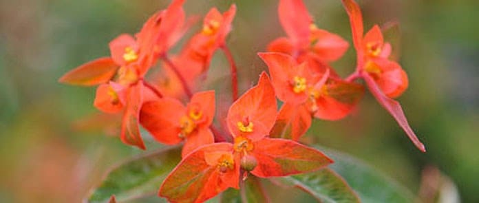
Combining colours
Colours also fall into two separate 'mood' camps: hot and exciting colours of red, orange and yellow that grab the attention; and cool, recessive colours of purple, blue and green. How you combine the different colours will largely dictate the atmosphere of the garden setting. To maximise the impact of a colour scheme you can either combine closely related harmonious colours that lie adjacent to one another on the colour wheel, or try opposing contrasting colours, that lie on opposite sides. For example, reds, oranges and yellows always work well together because they are not only near neighbours on the colour wheel, but they are all ‘hot’ colours. The missing elements, of course, are black and white and all the greys in between. Known as the ‘inert’ colours, they can be used successfully with anything – a useful tip for any would-be border designer.Muted shades
The colours most gardeners find difficulty with are the muted shades of browns, lilacs and pinks. They are usually a complicated mixture of primary colours, making them difficult to combine with other colours. The trick here is to work out the dominant primary colour in the muted shade and harmonise it with that colour. Most pinks, for example, are predominantly red, so these will make effective bedfellows. Lilacs, on the other hand, have more blue in them and will work well with purples.Restrict your pallett
One secret I have learned over the years is that by limiting the range of colours you use in a scheme you can increase the overall impact. In my blue and white perennial scheme, for example, I’m combing ‘primary’ blue and ‘inert’ white – a simple and effective partnership that’s both harmonious and cool. My scheme combines Perovskia ‘Blue Spire’, Festuca glauca ‘Elijah Blue’ and Geranium ‘Rozanne’ with white Echinacea purpurea ‘White Swan’, Achillea ptarmica ‘The Pearl’ and Miscanthus sinensis ‘Variegata’.